We don't use Photoshop, believe it our not, we make no use of the Adobe software. We use something that is free and very easy to use and it goes by the name of Canva. You can sign up with whatever email adres you have, but if you have an email you use for your blog, I'd recommend using that one because it's just easier to keep everything neat and organised.
On Canva there are numerous of design types that you can pick. These are basically sizes, you can also make a customary size of the canva you'd like to use. Amber and I always go for 'Presentation (16:9)' which is closet to the perfect size for our blog. The original size is kind of huge, but if you use blogger like us, the X-large photo size works really well.
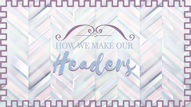
 Canva allows you to use a lot of free text designs which are honestly sooo gorgeous. However, do make sure that your text is readable. It matters more than the cute background picture you decided to take. We like to add the same text in a darker shade behind the original and shift a little left or right or up or down so it almost looks like your text is 3D. I myself, find this the best looking because your text will really jump out of the background and into the spotlight.
(Can't believe I am basically promoting this website omg lol)
Lately Amber I tend to use a lot of patterns as backgrounds for our headers, which I like better than pictures if I am being truly honest, and when I do use a photo I use the blur tool in Canva. Because like I said, your text needs to be the center of the header. It's the call to attention.
If you wanna play on the save side you can get free stockphoto's from unsplash.com, they have gorgeous pictures in high quality and you can even type what you are searching for into the search bar and you'll get a bunch of pictures that are relevant to that search therm.
That is basically all we do! It's not that hard and just a lot of matching the colours together so that everything looks cute. I would however, recommend that you keep your blog in the same shades, so if you use a lot of pastels, stick to pastels.
~ Shania
If you have any more questions, make sure to leave them down below!


Canvas seems like a great site! I use Picmonkey, it's really easy to use and free as well. I love your headers and colour schemes!
ReplyDelete